April 13, 2017
Reading Time: 2 minutes
Guerrilla Fitness Cross Fit Gym
MOVEMENT. The space in this Cross Fit Gymnasium had two intentions:
1) Create an office for the owners to have a reprieve from the dynamic activity of the patrons
2) Direct the patrons through an office space to where the exercise area is.
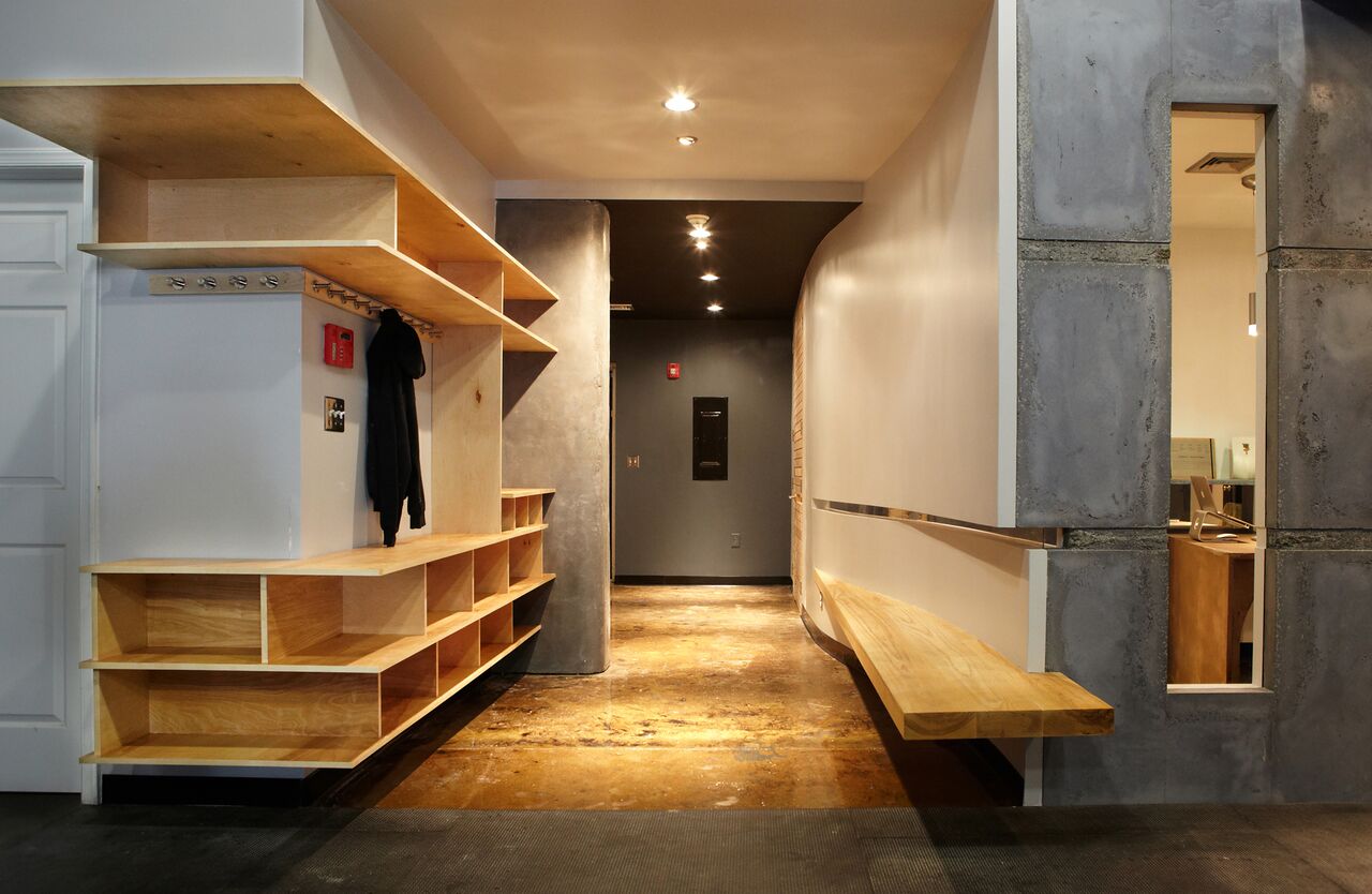
The layout of the spaces are determined by these factors. The shape of the desks and the wall in the office are designed to “funnel” the focus of the owners to the window that peers through to the exercise area, and is anchored on the one side by a roughly formed concrete monolith, acting as a totem.
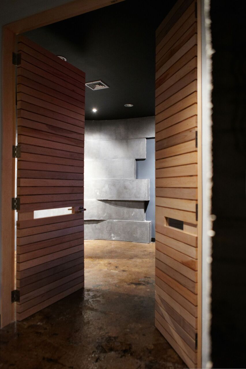
DICHOTOMY. Concrete is, at various times, both fully plastic and fully rigid. It has the connotations of solidity and longevity associated with it, but isn’t so stoic that it can’t be slender and graceful. It has the potential to be very sculptural as in Saarinen’s TWA terminal, or monolithic and lumbering as in the works of Kahn. Both men used the same material but evoked entirely different reactions. The use of concrete was prominent in this design.
DETAILS. All of the lines in the spaces are meant to augment the flow of traffic. The vertical edges on the large concrete wall are rounded where someone is meant to pass by. The slit of glass that follows along the curved wall flows around the corner in the concrete, as well as the custom made maple doors. The lights are positioned along axis flows, the lines of the door are horizontal and the floating ash wood bench has no vertical end supports that would visually impede the direction of foot traffic.
Project Name: Guerilla Fitness
Project Location: 30 Dumont Place, Morristown, NJ
Firm Name: Solid & Void
Owner Name: Michael Pond, AIA
By Stacey Ruhle Kliesch, AIA, AIA NJ Advocacy Consultant | Posted in AIA-NJ News, Uncategorized | Tagged: #AIANJAWARDS2016, #GuerrillaFitness, #interiors, ArchWeek17 | Comments (0)
 Guerrilla Fitness Cross Fit Gym


